Map Catalog Blog
Friday, August 1, 2014
Index value plot
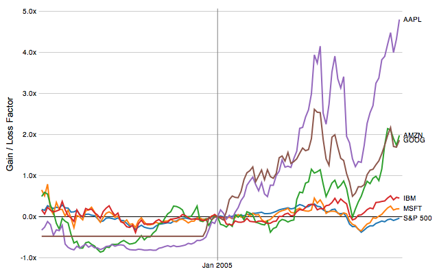
Below is an image of an Index Value plot map of the losses and gains of IBM, Microsoft, and the S&P 500. These map types are useful for illustrating changing values over a period of time.
http://homes.cs.washington.edu/~jheer/files/zoo/index.png
No comments:
Post a Comment
Newer Post
Older Post
Home
Subscribe to:
Post Comments (Atom)

No comments:
Post a Comment