Friday, August 1, 2014

Star plots

Below is an image of a Star plots map that compares reservoir levels.  This map type is useful for illustrating multivariate data in a single five point illustration.


http://aapgbull.geoscienceworld.org/content/84/7/1041/F11.large.jpg


Similarity matrix

Below is an image of a Similarity matrix that compares furniture types.  This type of map is useful for illustrating the likeness between identical data elements.


http://static.squarespace.com/static/51df0701e4b06c80c716ef55/t/521e4f9be4b0eda1c6fdae98/1377718178749/matrix.png

Stem and leaf plot

Below is an image of a Stem and leaf plot map.  This map type is useful for summarizing data points and the shape of a distribution.


http://image.mathcaptain.com/cms/images/41/stem-and-leaf-plot-with-decimals.PNG

Box plot

Below is an image of a box plot map that illustrates the building density against urban atlas codes.  This map type is useful for illustrating and comparing data-sets between two or more variables.


https://c1.staticflickr.com/7/6133/6021454611_8df1ab3b0c_z.jpg

Histogram

Below is an image of a Histogram map of the United States that illustrates the hours delays in traffic per year.  These map types are useful for illustrating changing data-sets with the use of color shading over a particular frequency or time period.


http://www.coolinfographics.com/storage/post-images/One%20Day%20in%20America%20-%20TIME.jpg?__SQUARESPACE_CACHEVERSION=1265651434100

Triangular plot

Below is an image of a Triangular plot map that illustrates the different types of gravel on the ocean floor.  These map types are useful for illustrating the differences in values between three specific data-types.


http://www.scielo.br/img/revistas/bjoce/v61n1/a02fig2.jpg

Windrose

Below is an image of a Windrose map over the area of Massachusetts near Boston that illustrates wind speeds.  This map type is useful for illustrating the wind speeds over a specific area and time period.


http://help.autodesk.com/cloudhelp/B3/ENU/Vasari-UsersGuide/images/GUID-14FE53F4-D212-461D-8AA6-1471D57F7BD6.png

Climograph

Below is an image of a Climograph map of the climate types across the world.  These map types are useful for illustrating climate features such as temperature and precipitation in a particular region or country.  


http://www.zo.utexas.edu/faculty/sjasper/images/50.24.gif


Population profile

Below is an image of a Population profile map of the change in resident population for the United States from 1990 to 2000.  These map types are useful for illustrating census data over a period of time.


Scatterplot

Below is an image of a Scatterplot map of the city of Pittsburgh, PA showing geographic density and diversity.  These map types are useful for illustrating the relation between two or more data-sets.


https://farm6.staticflickr.com/5114/14096784748_e393bd2251_b.jpg

Index value plot

Below is an image of an Index Value plot map of the losses and gains of IBM, Microsoft, and the S&P 500.  These map types are useful for illustrating changing values over a period of time.


http://homes.cs.washington.edu/~jheer/files/zoo/index.png

Bilateral graph

Below is an image of a Bilateral graph map of the assistance for HIV/AIDs in multiple countries during the year 2002.  These map types are useful for illustrating multiple data-sets through the use of bar and line graphs.


http://georgewbush-whitehouse.archives.gov/g8/images/hivaids1.jpg

Nominal area choropleth map

Below is an image of a Nominal area choropleth map of the Hispanic population in the United States.  This map type is useful for illustrating smaller data-sets which are typically illustrated through the use of different color shades.


http://www.valpo.edu/geomet/geo/courses/geo215/choro.jpg

Unstandardized choropleth maps

Below is an image of an Unstandardized choropleth map of the Indian and Chinese population in the United States.  This map type is useful for illustrating the differences between variables that are not necessarily averaged.


Standardized choropleth maps

Below is an image of a Standardized choropleth map of crime rates in the United States vs the Election results of 2004.  This map type is useful for illustrating averaged data over a particular region or land mass.


http://www.geog.ucsb.edu/~jeff/gis/choropleth_maps_files/election04_vs_crime03b.jpg

Univariate choropleth maps

Below is an image of an Univariate Choropleth Map of the presidential election between Obama and McCain.  This map is useful for illustrating only one type of variable on a single map.


https://www.e-education.psu.edu/geog486/files/geog486/image/NYT_1.png

Bivariate choropleth maps

Below is an image of a Bivariate choropleth map of the states with crop farms and those without farms.  These map types are useful for illustrating two variables in the same map type.


http://indiemapper.com/app/images/bivariate_choroMAP.jpg

Unclassed choropleth maps

Below is an image of an Unclassed choropleth map of the United States that depicts whether or not some human lives are worth more than others based upon state.  These map types are useful in illustrating variables that are not statistically averaged.


https://cartastrophe.files.wordpress.com/2009/08/human_lives_map1.png?w=655

Classed choropleth maps

Below is an image of a Classed choropleth map that illustrates the Cancer Rates in the United States.  This map type is useful for illustrating statistical data such as income and disease rates over a specific region or country.


https://www.msu.edu/~dougl126/images/cancer_rates_jenks.jpg

Range graded proportional circle map

Below is an image of Range graded proportional circle map of the Hispanic population in the United States. These map types are useful for illustrating a a specific value such as population with the use of proportional sized circles that are placed on a map in regards to distance.


https://www.e-education.psu.edu/files/geog482/image/hisp_circles.gif

Continuously variable proportional circle map

Below is an image of a Continuously variable proportional circle map of the foreign-born groups in the United States.   These map types are useful for illustrating multiple values within the same map type by the use of different sized circles.


https://www.e-education.psu.edu/geog486/files/geog486/image/bivariate_hue_size_0.png

DOQQ Maps

Below is an image of an DOQQ map over the state of Louisiana.  This map type is useful for illustrating equal areas of land regions by following the lines of latitude and longitude based upon a scaled grid.


http://lacoast.gov/maps/2004doqq/100Kgrid.jpg

DEM

Below is an image of an DEM map over the west coast of the United States.  This map type is useful for illustrating a 3D representation of a land's elevation through digital representation.


http://bard.wr.usgs.gov/images/demMap.jpg

DLG Map

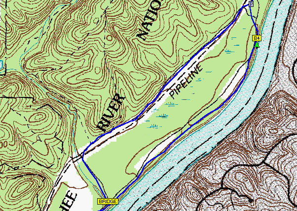
Below is an image of an DLG map of a region of Wyoming.  These map types are useful for illustrating digital line graphs of land boundaries, waterways, and other man made features such as roadways and railways.


http://web.wt.net/daba/dlg/images/Image6.gif

DRG Map

Below is an image of an DRG map of the Sequoia River.  These map types are useful for illustrating paper maps that have been uploaded to a computer system for digital viewing.


Isopleths

Below is an image of an Isopleths map that illustrates the annual wet deposition of the east coast in the United States. These map types are useful for illustrating equal areas of some type of geographic or weather condition.


http://img.wonderhowto.com/img/63/39/63451691937979/0/scrabble-bingo-day-isopleth.w654.jpg

Isopach

Below is an image of an Isopach map of Rio Blanco Tephra deposit.  These map types are useful for illustrating equal thicknesses of land and other geological objects such as rock layers.


http://www.geo.utexas.edu/faculty/barker/kempter/rbtephra.gif

Isohyets

Below is an image of an Isohyets map of mean rainfall.  These map types are useful for connecting equal points of rainfall over a particular region.


http://www.weather.info.bw/bulletins/data/bulletin_0210/rain_mean_jfm.gif

Isotachs

Below is an image of an Isotachs map of the geopotential height and temperature in the United States.  This map type is useful for illustrating equal wind speed points.


http://www.weather.gov/images/gsp/local_research/2005/15Dec_IceStorm/051215_00Z_500mb.jpg

Isobars

Below is an image of an Isobars map which illustrates the equal pressures of the United States during the spring of 2000.  These map types are useful for illustrating equal points on a map in particular with atmospheric conditions such as temperature.


https://www.sercc.com/education_files/saerspring_00isobar.jpg

LIDAR Map

Below is an image of a LIDAR map of a cliff and beach.  These map types are useful for illustrating shorelines and calculating total distances by the use of light detection and ranging.


http://soundwaves.usgs.gov/2007/06/LidarExampleLG.jpg

Doppler radar

Below is an image of a Doppler radar map over Louisville, KY.  These map types are useful for illustrating the movement and patterns of weather conditions such as rain, wind, and other storm types.


http://www.crh.noaa.gov/images/lmk/soo/Radar_Web_Images/CompRef_2125z_2Mar2012.png

Black & white aerial photo

Below is an image of a Black & white aerial photo of Harrisburg, PA.  These map types are useful for illustrating land areas and regions for real-estate purposes.


https://encrypted-tbn3.gstatic.com/images?q=tbn:ANd9GcQHcFSksy_dnZZ1IgXPOzaPnbsic18mLkR0yvnTh2L-lEfIiDXt

Infrared aerial photo

Below is an image of an Infrared aerial photo map of the snake river flood plain.  These map types are useful for illustrating land destruction such as mines and the impact to the quality of water sources.


http://www.nature.nps.gov/water/images/SRP1993aerial_2.jpg

Cartographic animations

Below is an image of a Cartographic animation which illustrates an animated representation of a storm system over a period of time.  These map types are useful for displaying severe weather conditions and other atmospheric situations.


http://visualoop.com/media/2013/11/Haiyan-Slams-Into-the-Philippines-Possibly-One-of-the-Strongest-Landfalling-Typhoons-on-Record-750x561.png

Statistical map

Below is an image of a statistical map which illustrates the differences in metropolitan and micropolitan populations in the United States.  These map types are useful for illustrating variances between populations and demographics.


http://polisci.emory.edu/home/assets/images/general/statistical_map_US.jpg